Later had outgrown a single path
Before the redesign, only 15% of new users scheduled a post within seven days. Reaching that moment required connecting social profiles, uploading media, choosing a publishing method, and scheduling a post. A questionnaire added requirements from multiple internal teams. A user could encounter up to 25 screens.
The problem extended beyond the length of the journey. As Later became a broader social media management platform, scheduling was no longer every new user’s reason for signing up. Shortening the same sequence would still leave that mismatch unresolved.
I audited the possible onboarding paths to make blockers, drop-offs, and performance benchmarks visible. I gathered stakeholder requirements and facilitated shaping workshops so the team could work from a shared understanding of the whole journey. My scope included end-to-end flow design, research prototypes, helping plan development phases, and implementation refinements with design and engineering partners.
Explore the original journey audit
The 3-Dimensional Onboarding Framework
I developed the framework as a common model for the redesign and future onboarding work. It asked how onboarding could evolve alongside Later’s features and the different reasons people came to use them.
From one required path to multiple ways to find value.
One destination
A shared sequence centered on publishing.
Different starting points
Support progress from where someone is, without assuming the same preparation.
Different goals
Extend the model to each feature’s moments of value.
Editorial summary of my original presentation. The scheduling redesign applied the model; expansion across features was the proposed direction.
1 · A linear path to a first post
The first dimension describes a sequence centered on scheduling a first post. It gives the journey a clear destination, but leaves little flexibility for people with different starting points or goals.
2 · Multiple starting points and moments of value
The second dimension opens that sequence into a nonlinear experience. People can have different entry points and reach useful moments through different actions. The design question becomes how to help someone progress from where they are, rather than assume everyone needs the same preparation.
3 · Extend the model across features
The third dimension applies that flexible approach across the product. In my presentation, I used Linkin.bio and influencer campaigns as examples of features that could have their own onboarding paths and moments of value.
This was the framework’s broader ambition: give the team a model for onboarding a growing product. The redesign below shows the concrete scheduling experience we worked on; extending the model across other features was the proposed direction.
Translate the model into a system of flows
We mapped separate UX flows before moving into interface design. I redesigned the end-to-end journey, helped plan the development phases, and built prototypes for user research. Early mockups also helped identify where existing components could support the experience consistently.
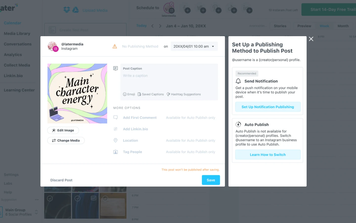
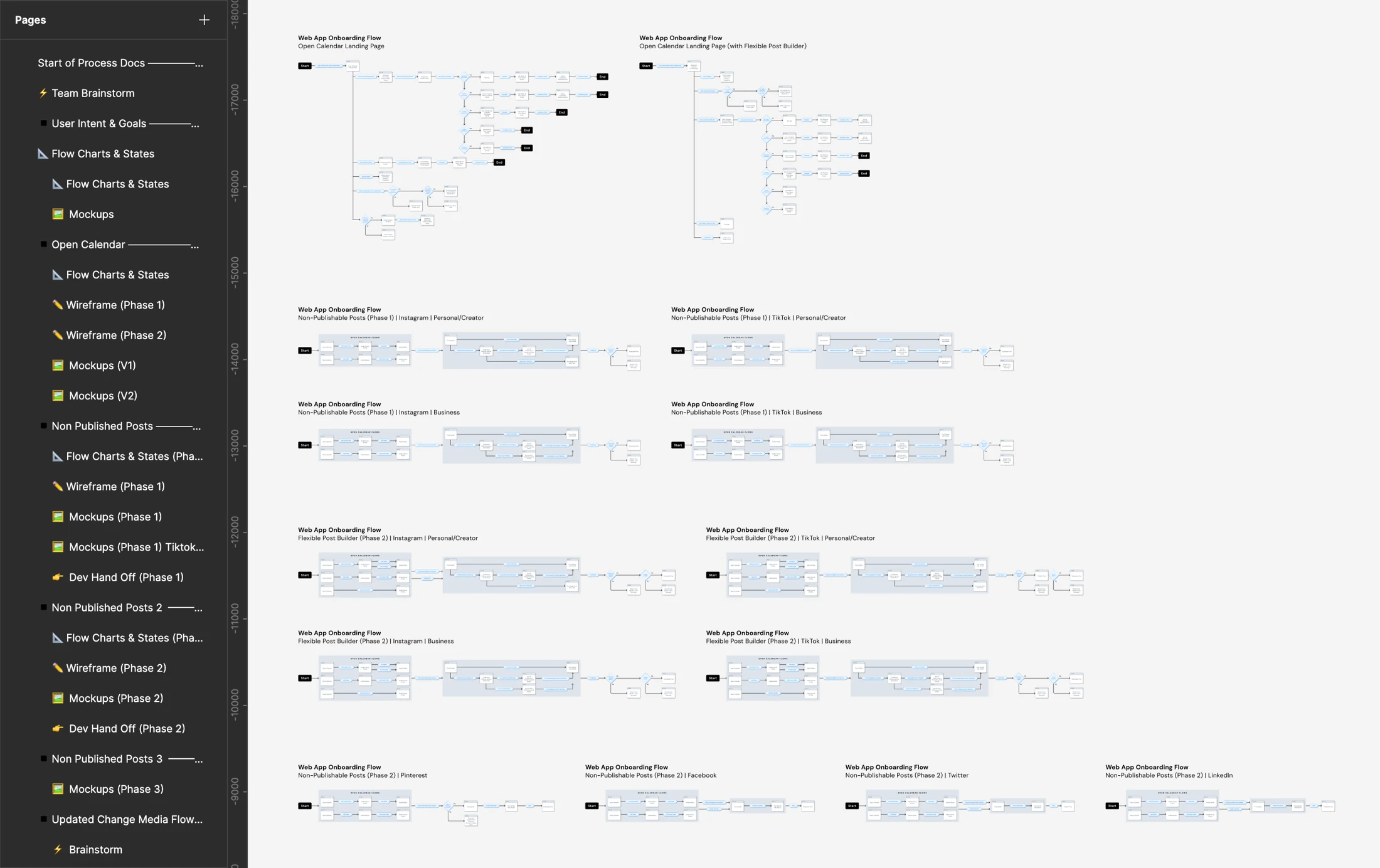
The flow board compares Instagram, Facebook, Twitter, Pinterest, LinkedIn, and TikTok. Instagram and TikTok introduce longer setup branches; combined-profile paths add another layer. A shorter journey still had to preserve those differences.
What changed in the experience: the questionnaire moved to sign-up, a test image made scheduling possible before users prepared content, and platform-specific publishing requirements remained part of the flow. The screens below show those changes.
Explore the original cross-network flow board
Make the first useful action easier
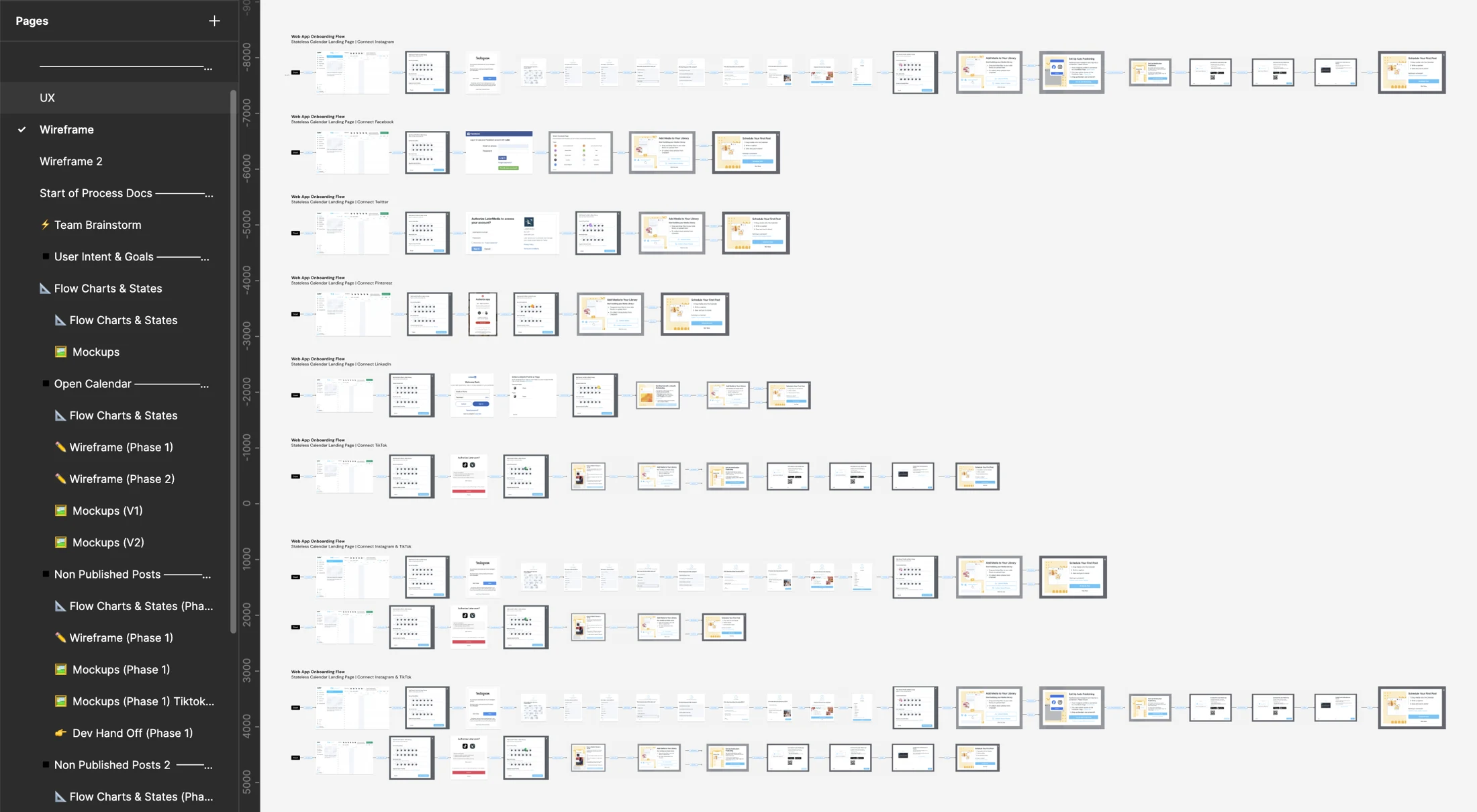
Bring the questionnaire together
Previously, the profile questionnaire appeared after connecting a social account and spread questions over multiple steps. The tradeoff was to reduce interruption without removing the information-gathering step. We moved it to sign-up and presented the questions together, changing its timing and presentation while retaining that step.
Let people try scheduling before preparing content
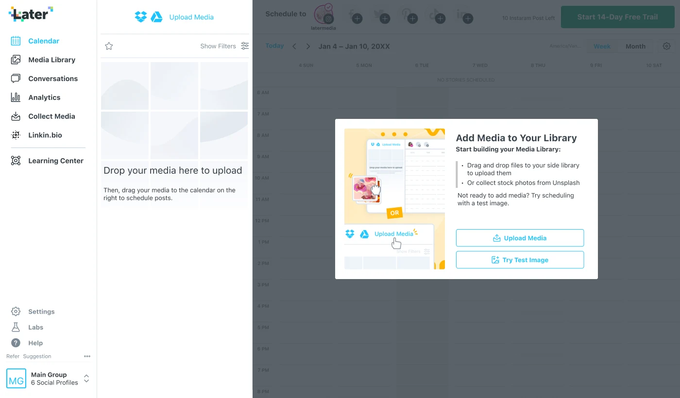
The earlier flow required users to upload media to continue, even if they were not ready to publish. A test image gave them a way to try scheduling without first gathering their own content.
Team usability research in January 2022 found different levels of readiness. A practice post helped some participants explore the interface with less risk; others were ready to schedule real content immediately. The study recommended keeping practice optional.
The design below offers both uploading media and trying a test image. It gives someone a way to explore before preparing content, while preserving a direct path for someone ready to make a real post. That is the flexibility the framework called for at the level of a specific interaction.
Preserve the real publishing constraints
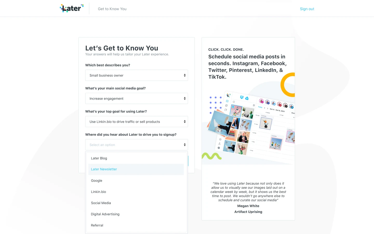
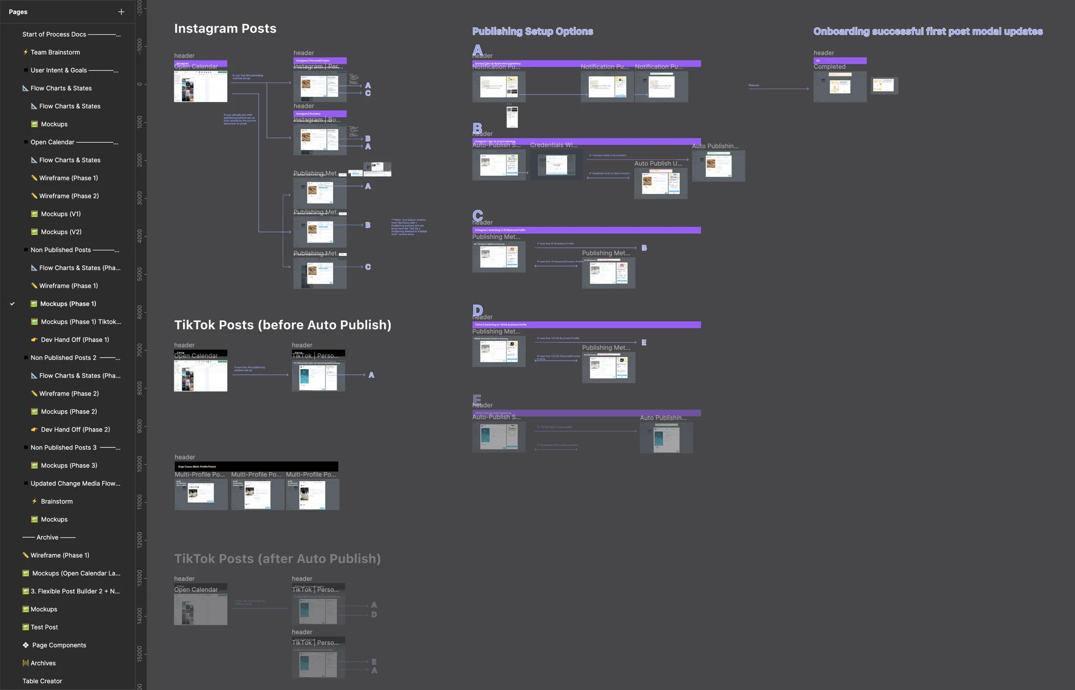
Instagram’s publishing flow introduced extra requirements that were significant blockers at the time. We were also designing around TikTok’s integration, which had similar complications. Other networks offered more straightforward publishing paths.
Those differences had to remain understandable within the simpler experience. I worked through the detailed flows and collaborated with design and engineering partners on implementation and refinements.
Explore the publishing setup board
A shorter journey, a broader model
Required onboarding screens fell from up to 25 to four. The original portfolio reported a 20% increase in new users opening Post Builder within seven days and 18% growth in free-to-paid conversions. I collaborated with the product owner on success measurement.
The interface changes reduced the effort needed to begin. The framework addressed the longer-term question: how should onboarding adapt as Later serves more goals? Together, they connect an immediate growth problem with a model for future product development.